Monster, Your Website is Calling. Take Down the Billboards.
Mon, 07 January 2008, 6:39 pm
Monster, and its new global agency BBDO Worldwide have created a much ballyhooed new ad campaign, “Your Calling is Calling”. I haven’t yet seen all of the TV spots, but from what’s been posted on YouTube (not by BBDO or Monster, mind you) the campaign is nothing short of brilliant.
My question is. WHAT were they thinking with their treatment of their global website homepages? The company line…
Monster visitors will experience a fully refined site offering greater usability and reflecting the tone of the “Your Calling Is Calling” campaign. The updated “My Monster” homepage provides instant access to personalized information, such as job search history, for easier job search management. Also, Monster’s award-winning content is integrated throughout the experience, delivering relevant insight and advice as seekers navigate through the site. Currently available in the U.S., Canada, United Kingdom, France, Germany and the Netherlands, the new look will be rolled-out to other countries in the coming months.
In addition, Monster has deployed a new search engine across all of its sites around the world after seeing the number of job applies increase significantly following the technology’s implementation in the U.S. last year. The engine allows job seekers to more effectively refine, modify and augment their searches and helps them more easily manage the overall application process.
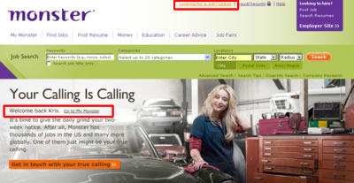
The execution is scary…literally. Have you ever gone on a journey up a rasta-businessman’s nose? Now you can. On Monster’s new homepage, you too can waste your precious time by selecting one of 3 misfit workers (rasta-businessman, Ivy League frat-boy chef, or cheerleader turned auto mechanic) and see how to reach your “true calling”.
As a paying client of Monster I’ve got more than a few thoughts on why what is there today is so wrong.
- Questionable Candidate Targeting. I get it. You can do anything, find a job to match your personality, stretch beyond your boundaries blahbeddy-blah. Here’s some positions we look for all the time: Experienced Accountants, IT Business Analysts and Developers, Contract Attorneys, Marketing and Sales Professionals. These are the professionals that run Corporate America. While being a chef or an auto-mechanic are admirable professions that they might be “Called” to after retiring from knowledge work in the cube farm, these images certainly don’t attract placeable candidates.
- Branding Instead of Utility. Apparently using your homepage as a gigantic billboard is the in thing to do these days to pitch products. Take a look at Adobe, Volkswagen, and Xerox to see what I mean. That same approach is awful when it comes to a job board, which is a productivity application at its core. Save the branding for TV, splash pages, YouTube, whatever. Your precious homepage real estate should be dedicated to the one thing; getting paying customers’ jobs in front of the right audience as quickly as possible.
- Keeping the Personalization Buried. Why is it, that when I log into LinkedIn everyday, it gives me all sorts of information customized to me, right from the homepage? What about Monster’s direct competitors Yahoo!HotJobs and CareerBuilder? Same thing. So, has Monster differentiated itself in a positive way by consuming the homepage with brandware and burying it’s personalized My Monster on a secondary page? Maybe, they did this so they can continue to put interstitials in front of my face before I can even get to the part of the site that is useful to me.

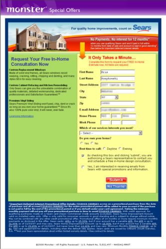
An interstitial that stops me from getting to “My Monster” HomepageAfter I’m logged into My Monster account and return to the homepage, It’s like the site doesn’t even know me. Instead I can suffer through the same ad all over again.

- Lack of Social Web Imagination. The TV ad is a smart, and unique take on the rate race that I’m sure the masses can identify with. Does it seem like the homepage campaign and the TV ad are even from the same company? Shouldn’t the online have been an extension of the TV? Couldn’t the campaign have become a game complete with battle arena and weaponry to fend off the impending week? Or Facebook prizes you can send to your friends to help eclipse the work week? The payoff for sitting through the brand ad sequence is a link to “Find Your Calling” which dumps you right back to the Job Search tool. **Thud**
- Global. Really? I very much admire the fact that Monster was able to unify their homepages globally. I’m shocked that they used the same exact campaign images and verbiage only translated. These are pretty far from the European aesthetic.
The new Monster TV campaign has the potential to really attract some high quality candidates that recruiters so desperately look for. The problem is when the candidates reach the website, they may run for cover. It is a bit frustrating that Monster goes to such great pains to listen to customer feedback yet customers have to wait until the site has been changed for the wrong to provide our candid observations on marketing campaigns. For a company that started on the web, they have a ways to go with their interactive marketing. Think I’m wrong? I’m all ears…
UPDATE 1/8/2008, 10am
I can tell the healthcare contingent has influence. This image has been thrown into the mix. That seems like a more appropriate image that addresses one of Monster’s largest customer segments.

Healthcare image used in ad rotation on Monster.com
UPDATE 1/8/2008, 3pm
Ivy League chef is gone. And YouTube does have the other commercial from the campaign – ‘Slots’.

