User Experience Design

B2B Client Attraction Websites

Tue, 15 February 2011

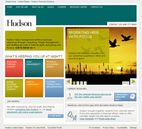
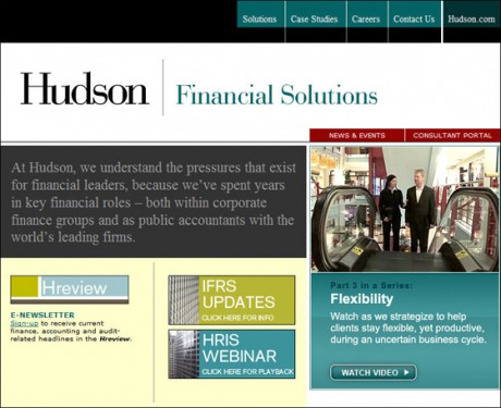
You do a little bit every day to move the needle. In 2010, Hudson did a lotta bit every day to try to move the needle. One of the things we examined were our Client facing websites for Hudson North America. In the staffing and professional services business what you try to sell most is trust. Trust that our people are the best at what they do, and trust that we have been there and solved your problem before. The problem is that most clients are skeptical when you talk about yourself all the time. “We’re the best this”, or “Look at all about us”. What they want to know is “How can you help me?”; “Do you understand my problems?”. So, we made a simple shift from talking about us, to trying to identify with client problems. We then featured some key case studies that prove that we can solve the kinds of problems that clients have.

These were baby steps of progress in 2010. Have a look at my Hudson Microsites 2010 Portfolio entry to read more details about the redesign project. I thought it was a good time to post it and get any comments from the market. We are learning, and embarking on further redesign work to continue to push our sites to help our clients address their business issues.

Hudson Financial Solutions Home Page 2004-2009
Click to view 2004-2009 home page

Hudson Financial Solutions Home Page 2010+
Click to view 2010 home page

Posted in: Interactive Marketing for Staffing Firms, Marketing Strategy, Projects, Staffing SEO/SEM, User Experience Design | No Comments »
Share/Save/Bookmark

How’s YOUR Staffing Firm Intranet?

Tue, 09 June 2009

Well, friends I’m nearing the end of the longest web project of my career. When we embarked on creating a new intranet for Hudson North America over two and a half years ago, I would have never predicted that it would take this long. Sure, we wanted to do it right. We engaged an ethnographic researcher to help us uncover the real needs behind the needs of our users. We took those requirements and handed them to a “real” interactive agency to get wireframes for workflows that would address the issues head on. From there, we chose a platform – Sharepoint 2007, no slouch of a platfom to configure, test, customize, and test again. We designed and branded the look and feel twice as the launch pushed through multiple leadership teams and re-branding efforts. It culminates this week with a “Beta” launch of the system via a link from our old intranet, an email from our President and a splashy Camtasia demo I’ve locked myself in my office creating for 4 days.

I’m excited about the prospects of what a “real” intranet can mean for our firm. It can be such a challenge for leaders to wrangle together a cohesive vision from far-flung offices and disparate work processes. Email just isn’t up to the task, and forget about the dreaded weekly conference calls. To create a truly productive and cohesive professional services firm for the long term, I believe your intranet must be robust, comprehensive, and adaptable to the constant change in the business. How else can you retain knowledge in a business with 40% employee turnover? Yet, when you search online for any evidence of staffing firm intranets, there is little to no information. I found a synopsis of Australian Job Board Seek’s Intranet redesign, but I have yet to come across a true staffing service provider’s (If you happen to see any coverage, please do forward me the link).

Is the lack of information an indicator of the staffing industry’s sentiment toward their intranets? Or, is it that everyone believes they have some super-secret formula for success that they are just unwilling to share? I would wager that staffing firms are currently focused on survival rather than productivity, but there are those who will use their intranet to position themselves for long-term success.

Posted in: Interactive Marketing for Staffing Firms, Projects, User Experience Design | 5 Comments »
Share/Save/Bookmark

The Designer Behind the CareerBuilder Ads: Nik Daum

Fri, 08 February 2008

Recently I’ve been stalking the CareerBuilder Super Bowl campaign, because I’m a customer of CareerBuilder, and more importantly because the study of Super Bowl ad strategy is very educational for those of us running much smaller marketing budgets.

I’ve also been honing my skills as social media participant. My first real foray into using Google Alerts, was to set one on “CareerBuilder Super Bowl Ads”. Today, it hit me with the kind of nugget that I never would have found without some real effort – the designer for the campaign, asking his peers what they thought of the ads.

Hey guys, I was wondering what your thoughts are on my ads that aired during the Super Bowl for an online job site called CareerBuilder.com

The comments on Youtube aren’t the most enlightening. You guys have more discerning tastes.

YouTube – Super Bowl Commercial – CareerBuilder.com – Queen of Hearts
Queen of Hearts

YouTube – Super Bowl Commercial – CareerBuilder.com – Firefly
Firefly

Two other spots from the campaign:
YouTube – CareerBuilder.com “Self-Help Yourself” Commercial
YouTube – CareerBuilder.com “Help You, Help You” Commercial

I’d love to hear your thoughts. Full res versions are on my site Art, Design, Direction and More! – NIKDAUM.COM

Thanks,
N

from designerstalk.com

You learn so much about the intent of a campaign and the thought process of the creative team by reading well…the thought process of the creative team

“Queen of Hearts” is the story of a woman stuck in an unsatisfying job. Unable to act on her own, her heart takes matters into its own ventricles and busts forth with gusto to take care of business.

This literal execution of “follow your heart” remains practically unchanged from the initial script. Thai director Suthon Petchsuwan added whimsey though the set dressings, casting, and edit. Though hard to notice, the huge lobster helped peg the boss as a bad boss. A placeholder heart made of foam with wire feet was used during shooting for the actors to reference. It was replaced with a CGI model made by the SFX firm The Mill. Originally, we had wanted to use puppetry for the heart to make it more comical and less slick. But these days it is actually easier and cheaper to use CGI hearts.

For the branding at the end, the animators of the show Robot Chicken built and destroyed a miniature office park. The logo and the words START BUILDING were made out of painted acrylic and mounted on a metal plate to slide along. Gravity and some compositing did the rest. It took 6 takes, and six buildings to get right.

The rest of the campaign is featured within Nik Daum’s huge portfolio. He is a talented artist and designer who is going to take up residence in my blog roll for a while so I can follow more of his work.

Posted in: Interactive Marketing for Staffing Firms, User Experience Design | No Comments »
Share/Save/Bookmark

Uncle Milty

Thu, 10 February 2005

I’ve always wanted to relate to people what it meant to be a designer from a State school to be chosen as an intern for Milton Glaser in NYC in 1997. It was a great honor, and one of the most interesting experiences I’ve had in my life to date. He is an amazing artist who holds the principles of design so much higher than anyone that I have ever met in my life. His studio was always so “un-web” though, so there was never a way for me to show others what it was like by linking there. Well, he has finally brought his studio onto the web, and now there is a short film by Hillman Curtis that gives a look inside his studio. Finally…. I can say I was there, and you might understand now what I’m talking about. Thanks to Zeldman for pointing out the new work.

Posted in: Interactive Marketing for Staffing Firms, User Experience Design | No Comments »
Share/Save/Bookmark

Architect as Designer

Wed, 27 October 2004

What if architects had to work like web designers? It would be like this.

Posted in: Interactive Marketing for Staffing Firms, User Experience Design | No Comments »
Share/Save/Bookmark

How To Be Creative

Fri, 13 August 2004

HowToBeCreative— It’s always good to read other people’s work about the angst involved in the creative process. It saves me from having to spend time being creative in expressing the angst involved in my creative process.

Posted in: Interactive Marketing for Staffing Firms, User Experience Design | No Comments »
Share/Save/Bookmark

UX Fun

Wed, 31 March 2004

Last night about 20 Designers from around Chicago met for the inaugural Chicago UX Special Interest Group meeting. Larry Marine from Intuitive Design and Research facilitated the session. A brave soul put up the site that she is in charge of redesigning and let the rest of us analyze it, hash it, and rehash it. It was certainly good to get back into the Chicago community of designers anfter an extended hiatus (having another kid will do that).

Hopefully the next gathering will allow for a bit more networking, because all I walked away with was the facilitator’s name.

Posted in: Interactive Marketing for Staffing Firms, Professional Networking, User Experience Design | No Comments »
Share/Save/Bookmark

Design Views

Fri, 07 November 2003

Thanks to Mark for pointing me towards this website put together by Jessica Helfand, William Drenttel and others. Dana, my roommate during my NY Internship, worked for their studio. I hereby pledge to read more design writings, and I’m now seeing why Walt is so in love with RSS Readers.

I should also be reading this design blog more frequently.

Posted in: Blogging, User Experience Design | No Comments »
Share/Save/Bookmark

Beautiful Web Design

Wed, 16 October 2002

I wholeheartedly agree with Sarah Horton’s ‘Beauty is Only Screen Deep‘. She laments about doing things in web design that confounds the medium. Particularly using graphic text for beauty, only to ignore the fact that users want to READ the text not LOOK at it. I too am frustrated, and I too am committing the same sins even in my latest web effort.

In the best case all web design should be using text as text, scaling to fit users’ screens, allowing for users with disabilities to access it, etc. But right now I am struck by how web display technology is getting better, but is still the worst case. I am getting up to speed on CSS, XHTML, XML, DHTML, etc. And I’m finding that it still is far too similar to the days when people hand coded PostScript to get their layouts to print on early laser printers. While we “young” designers take for granted the fact that we don’t have to do paper mechanicals, is designing for the web not almost nearly as bad? In those days making a mechanical took the designer away from conceiving of ground breaking communications, and set up the whole system of Creative Director (conceive of the concept), Art Director (execute the concept), Production Artist (execute the mechanical). In a pinch the Art Director could, and would do it all.

Now we have – just a few of the players listed here – the Creative Director (conceive of the concept), Interaction Designer/Info Architect (create the user flow), Usability specialist (test the experience), Art Director (execute the concept), and Programmers (execute the mechanical). In a pinch the “Web Designer” can, and will do it all. But wait, when trying to do so, you find out that the medium is STILL in the dark ages. The whole construct of the web and HTML was built to communicate text on screen, not visual experience. Even with all the latest standards and browsers, it still comes down to hand-coding in text, that which is meant to provide a compelling visual experience. It would be a totally different story if the web were built to be interactive based on a more visual platform.

Television works. It is completely designer controlled, and has dealt with device flexibility and accessibility. TV inaccessible? Turn up the volume, move closer to it, turn on the closed captioning, or the Spanish. What if Flash .swf + actionscript were the default web standard, natively supported by every browser without a plug-in? That’s closer to the right kind of medium for on-screen display, and designer flexibility. Plus it provides a much simpler content creation approach. Making a red square box doesn’t involve 13 lines of code.

Sadly, Flash .swf will not become the default web language. It is owned by Macromedia. Instead I encourage the W3C to provide whatever other positioning tags necessary within its standards to allow some great vendor to come in and make a completely free form HTML editing environment. The code that gets created must be perfect so that all the standards-nazis don’t complain. So that all the programmers don’t say “Oh what messy code that thing makes” (NetObjects Fusion anyone?). Give me Quark for the web now! Let it be accepted by all. Let it be the industry standard. Let it have all the options necessary to make the content it creates flexible, functional, accessible, and beautiful. When is the last time you needed a programmer to help you create a great printed piece? Let that be with the web soon! PLEASE!

Posted in: Interactive Marketing for Staffing Firms, User Experience Design | No Comments »
Share/Save/Bookmark

Usabilitissimo!

Fri, 07 June 2002

I had the pleasure of having free lunch at Maggiano’s yesterday. Ivan and I had great appetizers of stuffed Mushrooms and Spinach-Artichoke Dip. We then had a big helping of Eric Schaffer patting his own back on how to institutionalize usability using his Usability Central product. OK the guy is good. But he’s used to hearing that from many people. The idea is cool. I could buy all the usability documentation from him and put it on my intranet so I don’t have to build all that stuff from scratch. It will be cool when I come up with the $14,000 for it.

Posted in: Interactive Marketing for Staffing Firms, User Experience Design | No Comments »
Share/Save/Bookmark

aboutkris

This is my Life as a 37 year old husband and father of two and my Work as Executive Director of Marketing at Bennett International Group in Mconough, GA relocating from home in Rochester, NY.
more about me...

krisfeeds

tweettweet


linkroll

archivedkris

shades of k © 2000-2012, Kris Rzepkowski | powered by: WordPress, hosted by: Bluehost