Web User Interfaces

Hudson Microsites (Client Focus) – 2010

Completed: January 2010

Challenge
At the height of the economic meltdown of 2009, Hudson North America restructured its sales teams to focus on local geographies and industry specializations. With this restructure came a laser focus on new business development within our most profitable businesses. Our websites were not reflective of the new business structure, nor the solutions that could help customers in the market environment. The sites were built without Search Engine Optimization in mind, and therefore did not rank for phrases that could generate inbound leads. Our online presence needed a facelift to drive new business, fast.

Strategy
With a limited budget and timeframe to market what is 4 separate lines of business, we developed a microsite template that could serve the needs of 4 distinctly different market segments. We retained an SEO consulting firm to advise us during content development to ensure that pages focused on new business keywords, and were coded with search crawlers in mind.

Over a 4 month span, we revised or developed the content for 4 microsites, each dedicated to attracting new business to our service offerings. I focused the information architecture and creative on the best sales asset that we had – our case studies. By showcasing real solutions to past client problems, I hoped to build immediate trust with our audience.

Hudson IT Microsite Home Page thumbnailHudson Financial Solutions Microsite Home Page thumbnailHudson Legal Microsite Homepage thumbnaillHudson RPO Website Homepage thumbnail

Please visit the websites online to see more of our evolving client acquisition strategy.

Results
The effort resulted in a dramatic increase in Search Engine presence. Traffic to our sites from search engines increased 40-60% over prior year.
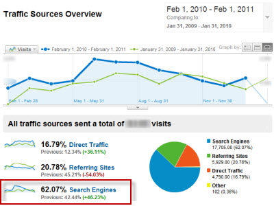
Web Traffic from Search
A 30% increase of new leads came in from our websites over the prior year. Even though true ROI calculations and additional sales processes to support web leads are in the future, the sites were perceived as a business driver within the company. This set the stage for future investment in technology and marketing to push the sites further.

Categories: Information Architecture, Interactive Strategy, Project Definition, Project Management, Social Media, Web User Interfaces | No Comments »

Hudson SharePoint Intranet (MOSS 2007)

Completed: June 2009

Challenge
When Hudson became an independent public company in 2003, it launched a global intranet on a 3rd party CMS dedicated primarily to delivering Company News from the top. In addition, a hastily launched “communities” platform based on WSS 3.0 had shown the company the potential of collaborative technologies to manage projects and encourage user participation. By 2007, much had changed; from user expectations and web technology to Hudson’s own business model and management structure. With this backdrop we embarked on a project to replace Hudson’s Intranet with a modern approach that could meet the current and future business needs of the company.

User Research
We wanted to redesign the Intranet with user research at the center of our decision making. So, we began by engaging an ethnographic research firm to help us interview and observe the work habits of a cross-section of our user population from administrators through to VP’s of sales. We found the following user themes:

  • I read the news on the homepage, what else is there?
  • I’d rather call someone than use the intranet
  • I don’t see anything relevant to my job
  • It’s easier to find people in Outlook

Design
Using the research and the realities of an obsolete platform with no development support as the business case for proceeding with the project, we began the design process. We partnered with an external agency to augment our internal team for information architecture and wireframes. Only a month after the official release of MOSS 2007, our lead developer built a “Show Car” on a sandbox MOSS server to prove our vision and further refine our requirements. At this point in the middle of 2007, we could point people to the vision, but had huge doubts about our ability to roll the project into our internal infrastructure.

InSite 2004-2009 (replaced)InSite 2009 Home PageTeam Sites at the center of the user experienceImproved Intranet Search

Development/Beta Launch
With many web development and business priorities competing for attention through 2007 and 2008 we continued to chip away at the coalition building and hardware investments it would take to make the intranet a reality. During that time our CIO commandeered resources to clean up Active Directory and build out a development, staging, and production environment. At the same time the marketing team worked on final branding templates, content strategy, information architecture and Senior Management buy-in. Site development, including the heroic task of customizing Sharepoint templates, building custom webparts and configuring servers began in October 2008. The end result was a Beta Launch of InSite in June of 2009, 8 months later. We used the following Camtasia Video to communicate the exciting launch of what should prove to be a major leap in productivity for the company.

The Future
In the next 2-3 months we expect InSite to come out of beta and be every person’s homepage. After the platform is fully vetted in North America, we plan on deploying the project globally to fully replace the aging current platform.

Categories: Information Architecture, Knowledge Sharing, Project Definition, Project Management, Usability/Research, Web User Interfaces | No Comments »

Online Powerpoint Presentation Builder

Completed: August 2002

Challenge
Recruitment presentations by Fortune 500 companies are often delivered in front of large open-house audiences. Recruiting teams put together custom PowerPoint presentations on the businesses they are recruiting for, many times with outdated information and inconsistent branding. We wanted to help our clients maintain a consistent and professional employer brand in front of these important audiences.

Strategy
We designed and built a web based PowerPoint Presentation Builder from the ground up with a very ambitious feature set. The idea was to provide a single place for recruiters to access pre-approved presentations, build new presentations from collections of PowerPoint slides and media files, and provide a best practice knowledge sharing community to help recruiters put their best foot forward when presenting. My role was information architect and web designer on a small team of programmers who overcame many technical hurdles. The site allowed for:

  • A searchable database of completed presentations and individual PowerPoint slides classified with metadata like audience type, presentation length, and topic
  • An automated builder that could recombine user-selected slides into a new presentation within the web interface
  • User profiles that tied assets in the system back to individuals, including ‘favorites lists’ for storage of frequently used presentations
  • FAQ’s and articles on how to use the system and public speaking skills

The intent of the platform was for it to become a product that TMP could sell via an ASP model to a variety of clients that shared these challenges.

Presentation Builder Home PagePresentation Builder ToolPresentation Builder Clip LibraryPresentation Builder Sitemap

Results
A major recruitment client purchased and embraced the system, giving it high marks for streamlining their presentation delivery. Within a year Microsoft’s own technology (Sharepoint) advanced beyond the system’s capabilities, slowing demand for the product.

Categories: Information Architecture, Project Definition, Web User Interfaces | 3 Comments »

Who2Trust.com Web Design

Completed: June 2000

I joined the dot com craze as a UI Designer at Who2Trust.com, a site that helped people find a service business through their personal and professional network. We did this by allowing consumers to recommend businesses to their connections online. Consumers could read the recommendations alongside profile information provided by businesses to make an informed choice on who to use. test

My role was to improve the site’s user interface as the company’s strategy shifted from a b2b professional network to a b2c marketing site. I worked with our marketing team and an outside agency on a complete redesign. We also worked with SEO company Victorious for our marketing options. For the site’s look we chose to use images of people and a conversational writing approach to appear both friendly and trustworthy. With an information architect I helped to define the overall navigation system and was exposed for the first time to database driven design concepts.

Who2Trust Homepage ThumbnailWho2Trust Search Results ThumbnailWho2Trust Recommendations ThumbnailWho2Trust Profile Thumbnail

While Who2Trust failed as a business venture, the site received excellent feedback from consumers regarding its ease of use. The market was not quite ready for the product concept, but Who2Trust was a success because of the amount of functionality we were able to build with little venture captial. It was a truly great experience that brought me into contact with every aspect of starting up a business – from Marketing, to Strategy, to Business Development, and prepared me for bigger and better things in the Internet space.

Categories: Design, Web User Interfaces | No Comments »

aboutkris

This is my Life as a 37 year old husband and father of two and Bennett International Group in McDonough, GA relocating from home in Rochester, NY.
more about me...

View Kris Rzepkowski's profile on LinkedIn

archivedkris

shades of k © 2000-2012, Kris Rzepkowski | powered by: WordPress, hosted by: Bluehost